The design of Windows 8 has been received both very well, and very poorly. Microsoft’s complete redesign of the Windows operating system is the biggest change in the OS’s history, and it has split loyal PC users down the middle, with people either loving or hating the changes.
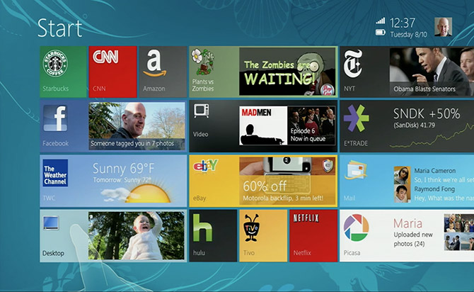
The biggest change, and the one that has caused the most confusion, is the new Metro tiled interface which is clearly optimized for touch-screens over the traditional mouse and keyboard use. Personally, I think it looks good, but doesn’t work very well for businesses or people who want to use their PC for anything other than games and social networking.
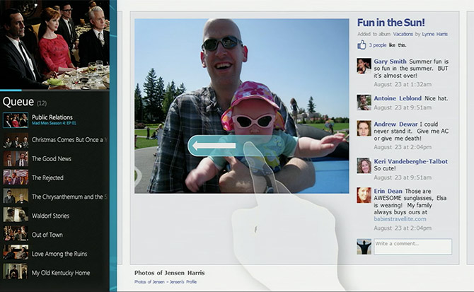
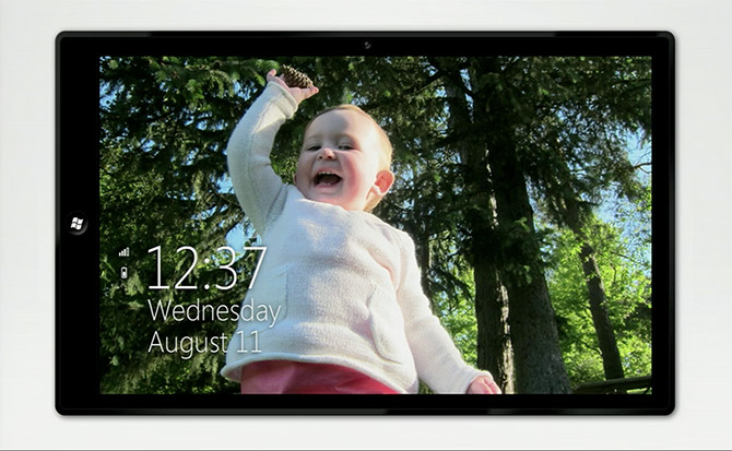
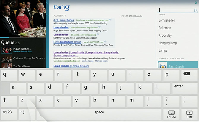
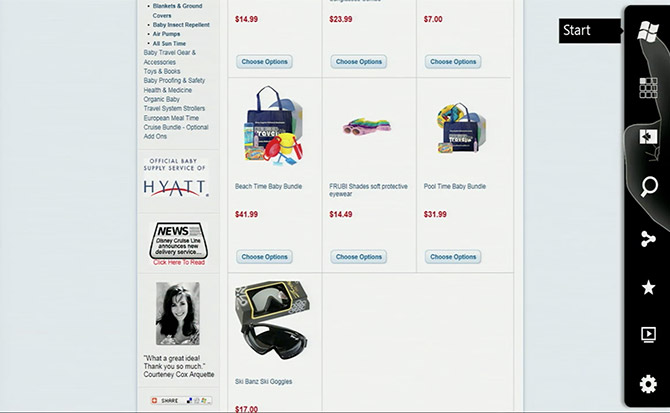
Microsoft have released early mock-up images of what Windows 8 was set to look like in 2010, just one year after releasing 2009. Obviously, Microsoft never intended to release the product like appears in the images below, which is why it looks very untidy. However it’s the clear base of what we see today after the full launch of Windows 8.


