For the past seven days, I have been using Facebook Home, the social network’s home replacement for Android, which pushes people ahead of apps. So far, the only device which comes pre-installed with Facebook Home is the HTC First, which in reviews around the web has been praised for allowing the user to switch back to stock Android, which doesn’t sound too good for the launcher. After one whole week of using only Facebook Home, here are my views.
I’ll begin by saying I’m not the biggest user of Facebook. I always have it open in a tab on Chrome, but usually just because I use the messaging service quite a lot. I occasionally see what people are up to, and might upload the occasional photo here and there, but most of the time I opt to using Google+ or Twitter. Oddly enough, this is one of the reasons why I was eager to try out Facebook Home, to see if it would push me back in the direction of Facebook, forcing me to start using it like a proper social network again.
I think it would be silly for anybody to say that Facebook Home doesn’t look brilliant. The design of the Cover Feed (the main lockscreen/homescreen) is minimal, clean and extremely interactive. If somebody has shared a photo it displays that in the background, and if somebody is just updating their status, it shows their cover photo. Swiping right and left is an extremely simple way to navigate the news feed, and it’s much more enjoyable than browsing Facebook on the official application or even on desktop.
Double-tapping the screen ‘likes’ the status or photo you are currently looking at. I love this feature with Instagram, however it is extremely easy to accidentally like things when it takes up the entire screen, especially if you have a large device like the Note 2 I own.
When you have a text, missed call or Facebook Message, a neat little notification shows up in the middle of the screen. These are extremely interactive and can be easily removed from the screen. I’m told that on the HTC First, these notifications display things from more applications, but for everybody else there are only a select few.
At the bottom of the Cover Feed is your profile photo in a small circle. This disappears as you swipe between statuses, however can be brought back up by tapping the screen once. Once you hold down on your little bubble, you can pull it three ways. Swiping to the left brings up Facebook Messenger, swiping upwards opens the app drawer, and to the right brings up the last application you were in. All of these shortcuts are useful, but it would have been nice if there was a way to get directly to the camera application, especially given that Facebook is extremely image-based at the moment.
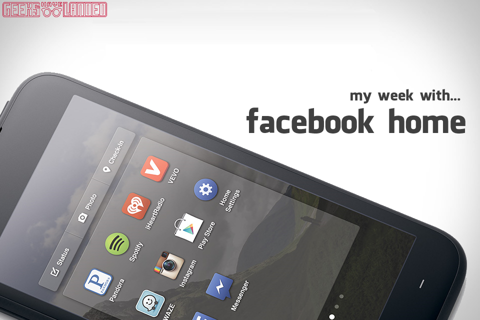
The app drawer is pretty simple, but works absolutely fine. You can organise all your favourite applications on several different pages, and then swipe to the left to see all the apps installed on your device. At the top of the app drawer you are given the only widget you can ever use on Facebook Home, which allows you to post a status update, share a photo or check in. It takes a little more set up time than most other app drawers, but it’s worth setting up so that you don’t have to scroll through your entire app list to find what you want.
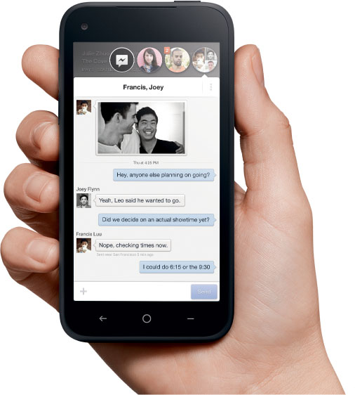
Chatheads is by far the best feature of Facebook Home, even though it’s available without the launcher itself. Chatheads pops up a little bubble when somebody tries to talk to you, which you can then move around the screen as you navigate the phone. It pops up over every application, other than full screen videos, which is a very nice touch. What makes this feature even better is that now Facebook Messenger can act as your SMS service as well, so chat heads work for regular texts. Including SMS in Facebook Messenger makes Facebook Home feel a lot closer to a complete operating system, rather than something you slap on top of your Android UI.
Things I’d like to see
Facebook have said that they plan to release updates every month, which is extremely promising and could mean that it improves very quickly. Here are some features I’d like to see in future updates.
- Camera shortcut – It seems extremely odd that Facebook didn’t include this, but at the moment it remains one of Facebook Home’s biggest flaws.
- Phone/Contact shortcut – Another shortcut that is missing is the phone icon, which is something we simply expect to see when we turn on our phones. You can access it pretty quickly by having it on the first page of the app drawer, but it would be great if it could be accessed from the Cover Feed.
- Instagram integration – As Instagram is a part of Facebook now, it would be great to see it integrated further within Facebook Home, either by displaying images in the Cover Feed or by having easier access to the app itself
- Friend chooser – One of the main issues with Facebook Home is that you can’t have control over what your friends share, and what shows up on your Cover Feed. At the moment, you can fix this by going through your friends and selecting ‘show on news feed’, but it would be great if it became an option on Facebook Home, so that you could go through ticking which friends you’d like to appear on Cover Feed.
- Better Cover Feed filter – At the moment, content on Cover Feed seems pretty random. It shows things that have just been posted, and then you’ll swipe to the next page to see something which was uploaded a few days ago. Their doesn’t seem to be any structure to what appears, so it would be great if this could be organised better.
- Chathead management – It’s cool how Chatheads can appear just about anywhere, but it would be even cooler if users were given the choice of were they appear. You might not want them to appear over the top of some applications, but then not mind if they appear over a video or photo. Giving the option would be a very good feature.
When I look back at my first week using Facebook Home, I can’t help but feel I’ve been very impressed. It certainly has flaws, Facebook wants to make it a simple experience, but they might have overdone it just a slight amount and made it more restrictive than anything else. Chatheads is something everybody who uses Facebook should use, even if they don’t want the full Home experience. However I strongly recommend you try out Home, as it really does force you to interact more with your friends, and depending on what they share, can make your phone look magnificent.
Facebook Home is off to a great start, and the future looks bright with monthly updates. When I downloaded it, I figured I’d remove it the second I had finished the week analysis, but I think I’ll keep it enabled for just a while longer.
Previously
– Facebook Home: First Impressions


