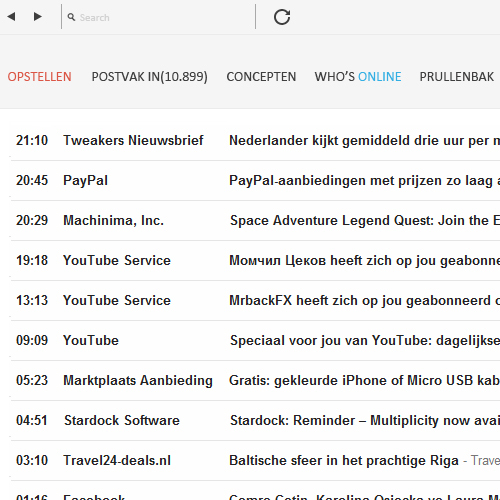
In the past, I’ve covered Facebook and Twitter concepts, but never Google. I’m already a huge fan of just about every Google product, as I’m an avid Chromebook and Android user, however I’m always interested to see how people thing Google could edit their design.
This concept, created by Burak Turfanda, imagines a completely new Google experience.
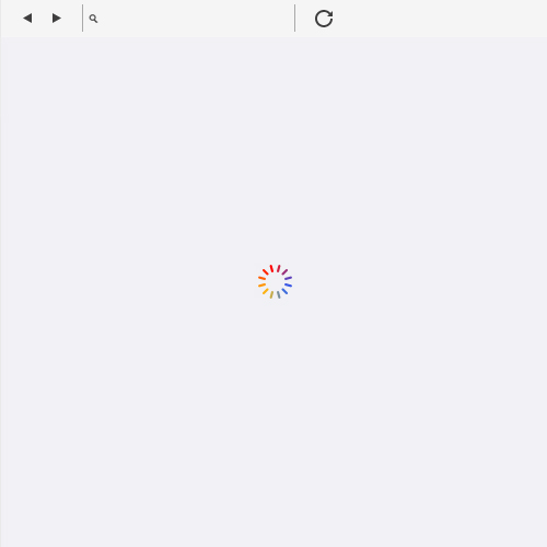
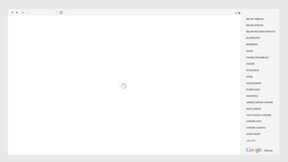
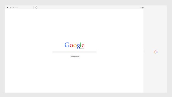
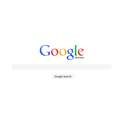
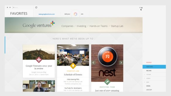
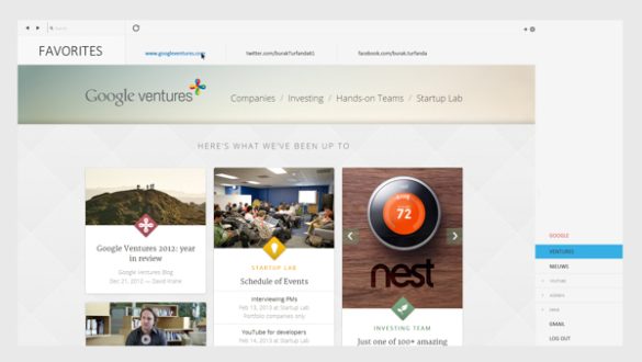
He begins by editing the Chrome browser, which at the moment has arguably the best design of any web browser. He’s edited it to that it has a very flat look, which fits in with what Google have been doing with Google Play recently and Google Plus recently.
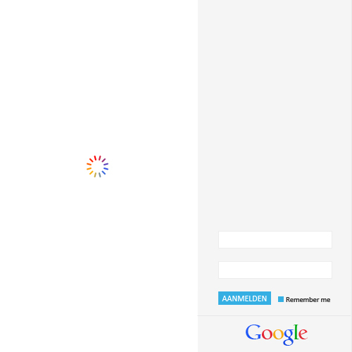
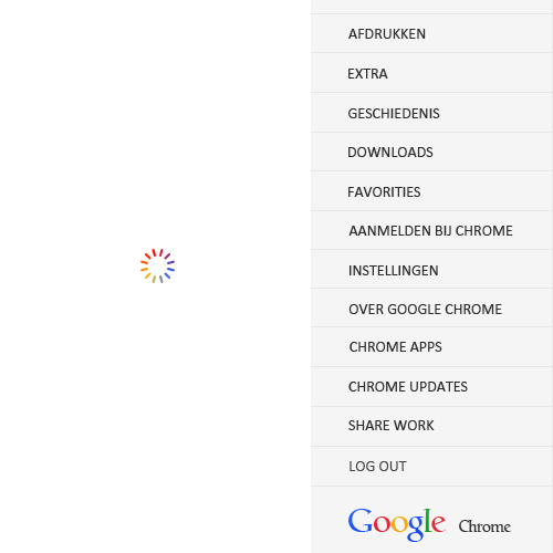
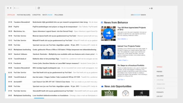
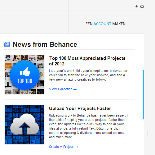
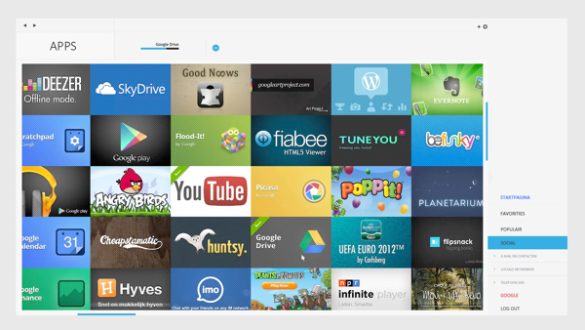
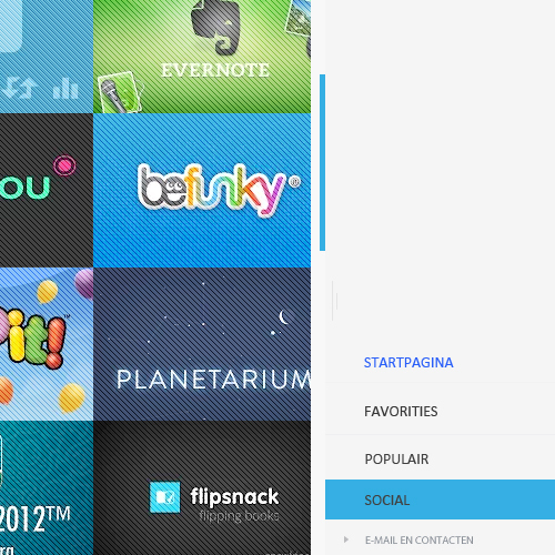
It’s hard to tell from the images, but it would appear that there is a right sidebar at all times on the browser, which is where the user can sign into their Google profile. Then, when visiting other sites, it looks as if the links in the sidebar change, according to what site is being looked at. All the websites in the images are Google services, but the idea of the sidebar changing for all the most popular websites, like Facebook and Twitter, is an extremely interesting idea.
He has also edited a significant amount of Google’s web services, including Gmail, which has a slightly altered colour scheme to the one which is live at the moment, and it looks very similar to the browser. He has also redesigned the Google Ventures website.
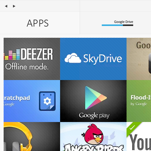
Possibly my favourite part of the concept, is the redesign of the Chrome Web Store, where Chrome users can download apps and extensions. Again, the current design by Google isn’t exactly shabby, however this version looks simply incredible. All the images of each app has been merged together, creating a seamless tiled interface. The page is full, from edge to edge, with images of each app, with the Chrome sidebar navigating the categories.


