Fans of the popular news reader ‘Pulse’ have today been greeted by a new update, version 3.0. The update refreshed many aspects of the application, including the icon.
“Our redesigned app is invigorated, alive, bolder and better than ever before. With heaps of fresh features and a sleek new design, this next step in news reading will rock your world.” – Pulse Blog
As mentioned above, the first thing you notice about the update is the refreshed icon. It looks a lot better, now displaying bright blue rings instead of the old one which only showed the name of the app on a dark background.
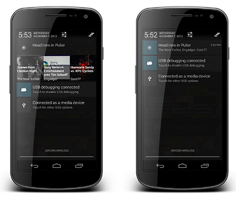
There are loads of new features, including unlimited pages, infinite scrolling, improved navigation and an enhanced widget for Android. Speaking of Android, in my eyes the best feature of Pulse 3.0 is the better notifications for Android users. Taking advantage of the expandable notifications of Jelly Bean 4.1, Pulse 3.0 now displays headlines at the top of the pull down notification bar, even displaying the images of the headlines.
Pulse 3.0 is available right now on iTunes and Google Play.


