You don’t have to have been reading Geeks Have Landed for very long to know that I’m a huge fan of applications which use a very minimal design. I’m a firm believer that operating systems and designs that are packed with buttons and images look very messy and are a nightmare to use. However, there is such a thing as ‘too minimal’. Where an application has such little design that it simply looks lazy. Let me explain.
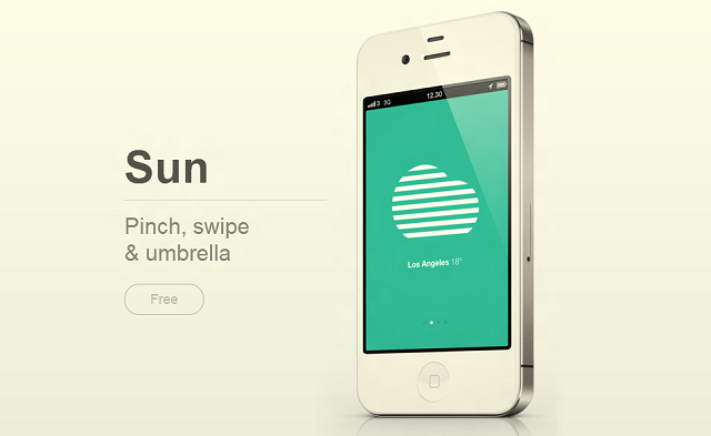
The majority of the time I find this problem with weather applications. I haven’t mentioned anything until now but following the RedmondPie article on ‘Weather Neue‘, this application has received quite a lot of media attention just a few days after UltraLinx and TheVerge did an article on ‘Sun’, a minimal weather application for iOS which is browser-based.
Both of these applications boast a minimal appearance and there is nothing wrong with that. However in my eyes the design is only half of an app, it needs to serve some sort of function. No matter how nice an app looks, it’s not going to be regularly used if it has no purpose. A lot of downloads, sure, but very little usage.
Sun is a good example of this. It looks brilliant, but at the end of the day is a small picture on a huge screen. You can view a very plain insight as to what the weather will be in the future, but not a lot else. If you want to what the weather is like, there are a million and one free apps which can give you the current weather, and the weather for the foreseeable future. Not to mention the official iPhone weather application. There is such a lot of space available on the screen on Sun that I feel they could have just added a little bit extra, while still keeping the minimal tag.
So, what is an example of a minimal application which offers good functionality? Well, one that pops into my mind is Alarm by DoubleTwist. It has a gorgeous design which has very few buttons. The settings have a few toggles here and there, but the actual clock can either be a very subtle flip clock or an analog one. At a glance, it looks like it lacks a lot of features, but in reality it offers more features than most on the market.
By saying that an application should be minimal, I don’t mean that it should lack features. It’s okay to have loads of features as long as the settings are hidden beneath a beautiful exterior. There was a time when it was cool to have lots of buttons and lights flashing on a screen, I guess it was seen as futuristic. But now there are very few people who would download an application that’s ugly when there is an app that can do the same thing in a nicer looking package.
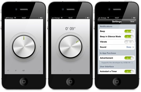
Another good example is Minimal Timer, available on iOS. This has to be one of the most minimal apps I have ever used both in purpose and in design. It’s a timer which is set by rotating the dial. When you let go, the dial begins to turn, counting down. It’s free, does what it says it will do and does it very well. As I said before, it doesn’t matter how ugly and crowded the settings are as long as the user interface which people will see is decent. The design, despite being very minimal, is done very well with effects on the dial and a nice textured background. It’s a good application and blends the line between minimalism and boredom.
An app that does this badly is Weather Neue which I mentioned above. I don’t wish to ‘call out’ the developers of these apps, they have a lot of potential. However unlike Minimal Timer or DoubleTwist, the design is not only minimal, it’s boring and lazy. The background on any of the settings is boring and the text is a default one found in any good text or image editor. There is nothing about this application which makes me think it could stand out against the competition. It’s an example of an application which appears to have had little time spent over it, however has gained media attention on the ground that it can be considered minimal.
So, that’s my opinions. I feel I may have stepped on my toes a few times through the article and have angered a few fans of these applications, but nevertheless please share your opinions in the comments below.


