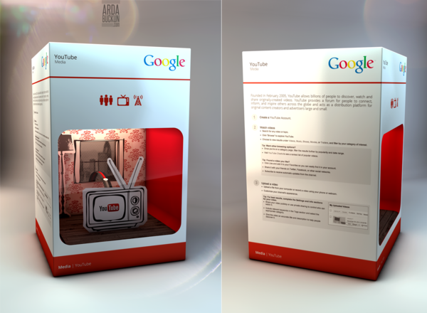
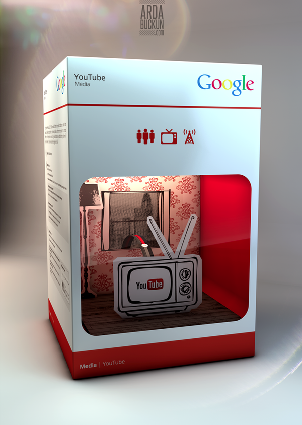
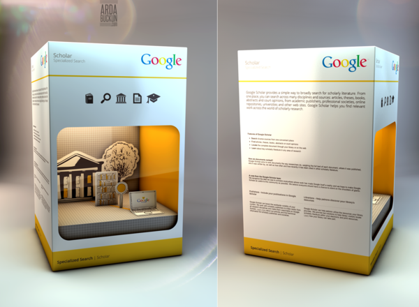
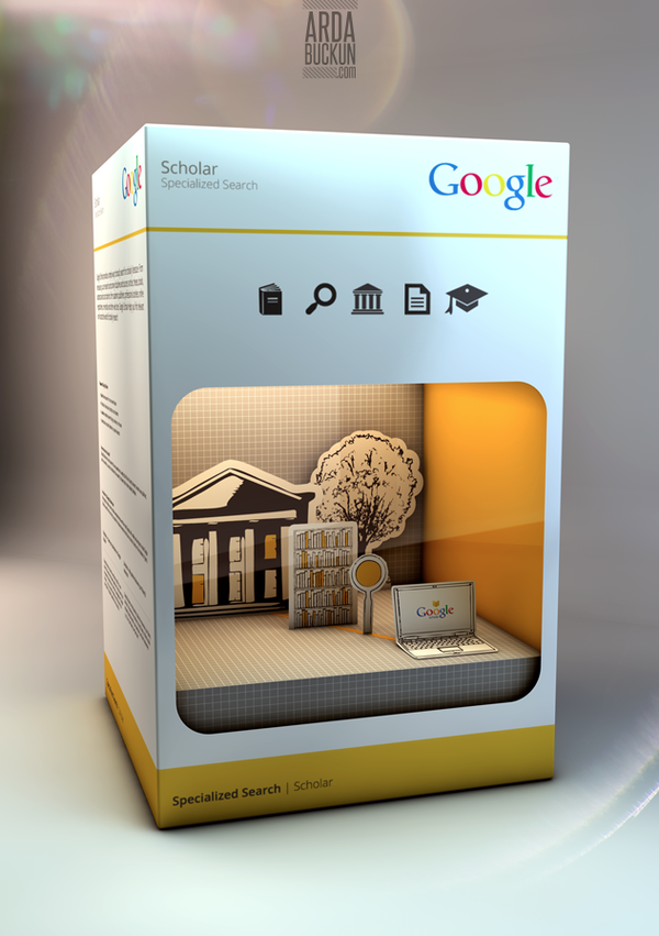
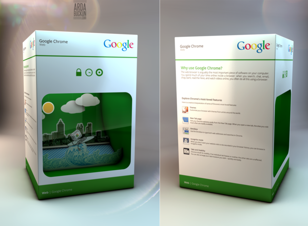
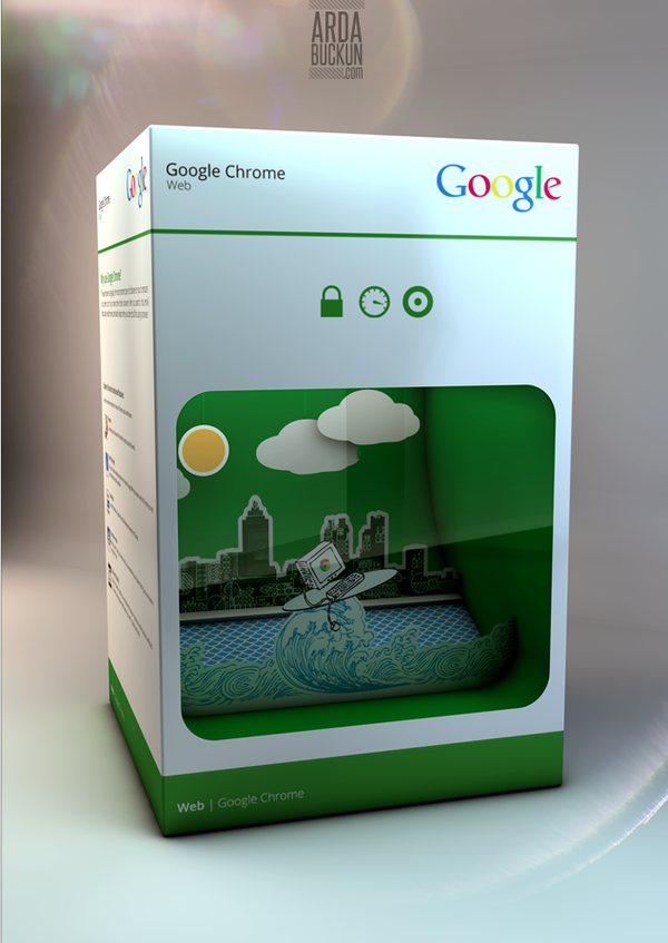
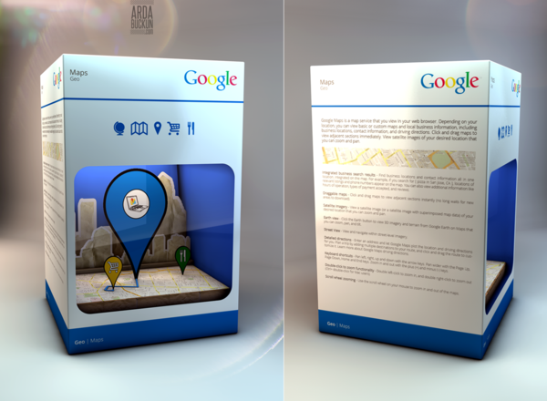
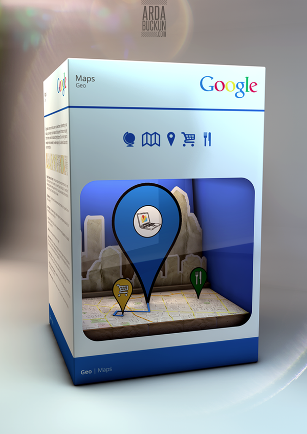
Google always uses a very minimal design on their products, much like Apple they use a lot of white space, which makes the colourful logo stand out against everything else. The difference between the two companies though, is that Google never have a chance to show their designs in a form of actual packaging, as it’s all online.
Arda Buckun, a digital artist from London, had this though, and took to creating what he imagined the packaging to come out of Mountain View would look like.


