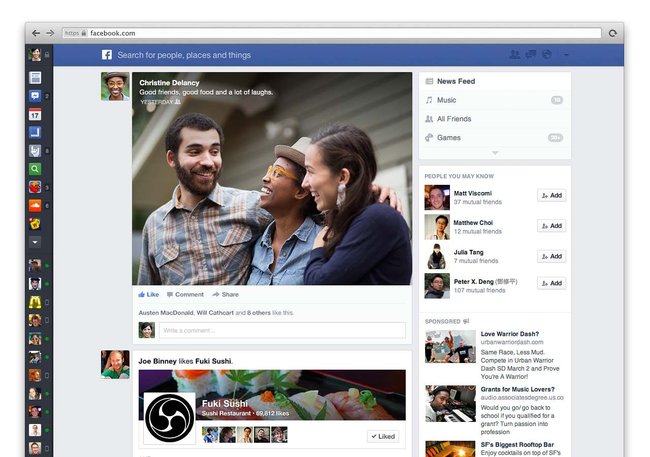
Last night, Facebook revealed a new design to the News Feed, and it’s extremely impressive.
The new design has been compared to Google+, due to the large images and videos in the news feed, as well as the rounded edges on statuses.
Facebook has been plagued by a very poor design for the past couple of years. It functioned quite well, but the design was far behind competing social networks. The new design squeezes out a lot of that annoying white space, and replaces it with informative content, which can be organised into different categories.
Read more about my thoughts on the new Facebook design, over at The Blocc


