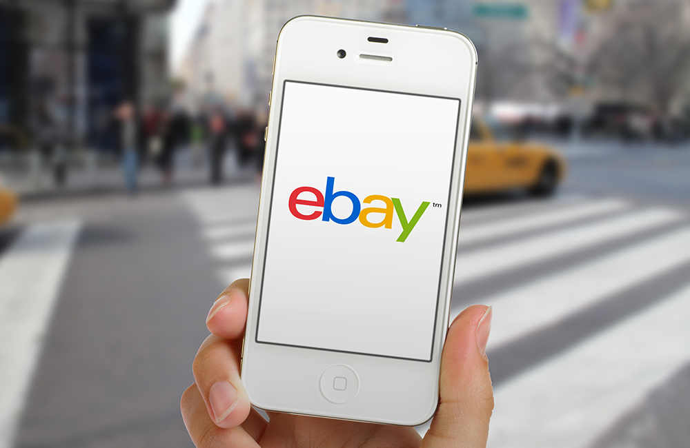
17 years ago this month, the world’s largest online marketplace and one of the biggest websites ever launched. To mark this birthday, eBay have published a brand new logo.
The eBay brand has always been represented with the jumbled eBay text which overlaps each letter. If it were to be designed now, it would be thought of as ugly and would never catch on. But after almost 2 decades of using the same logo, it’s become one of the most recognizable icons around the world. I’m sure the decision to change the logo wasn’t taken lightly given this fact, the new logo still uses the same colours in the same places so that people can still recognize it, but it’s been tidied up a bit.
“Our refreshed logo is rooted in our proud history and reflects a dynamic future. It’s eBay today: a global online marketplace that offers a cleaner, more contemporary and consistent experience, with innovation that makes buying and selling easier and more enjoyable. We retained core elements of our logo, including our iconic color palette. Our vibrant eBay colors and touching letters represent our connected and diverse eBay community – more than 100 million active users and 25 million sellers globally and growing.” – Devin Wenig, President of eBay.
See more images of eBay’s new logo, and a full statement by Devin Wenig on eBay.


