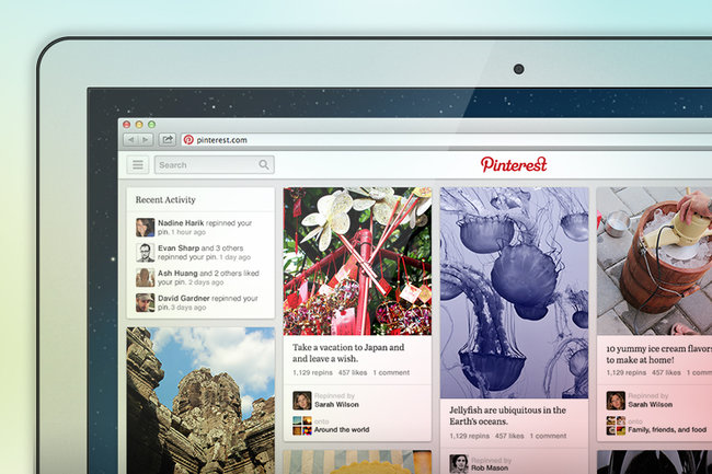
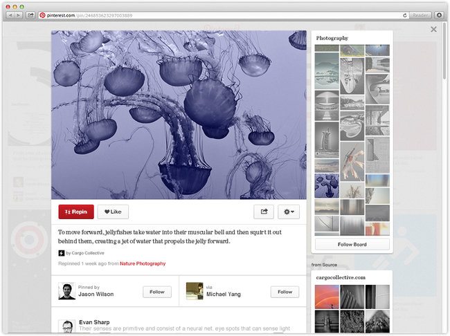
Pinterest are currently in the process of testing out a new user interface, designed to help users navigate to specific ‘pins’, which are then displayed in a clearer and larger way than before.
Revealed in the official Pinterest blog, the update will change the design significantly, but the downward-scrolling tiles will remain. From the images included in the post, it seems the main change will occur when viewing an image, as the user will be able to see other pins from that board to the right of that image.
At the moment, the update is only rolling out to a handful of people, but you can apply to be considered for early access by visiting the blog post.


