Feedly has received a complete user interface re-design in an attempt to better compete with the big names of FLUD, Flipboard and Pulse.
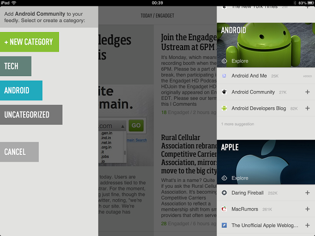
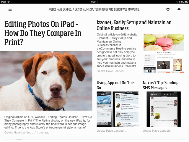
In many ways, the new update is similar to Flipboard. The actual pages of news content are similar in the way the articles are spread out on the page, however the way content is added is a lot more organised and beautiful than any other news reader on the market. News sources are found in a newly designed catalogue which organises each source according to what the content topic it should be in. Once you have selected the source that you wish to follow, you can add it into different sections of your sources which can be named whatever you want. For example, I have ‘Technology’, ‘Apple’, ‘Android’ and ‘World News’.
The New Feedly Mobile from Feedly on Vimeo.


