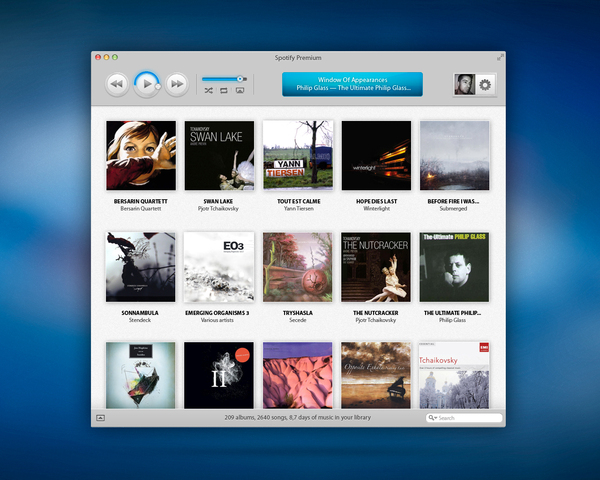
Spotify is by far my favourite music streaming application, mainly due to the fact that it is so easy to sync through my devices. It has it’s share of mistakes such as the heavy Facebook integration, however it still remains the best web music service in my eyes. Earlier this year, Spotify for iPad was finally released, shortly followed by the new Android update. Both of the applications had a beautiful user interface which begs the question….Why are we still using the boring old Spotify desktop application?
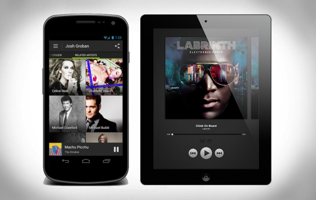
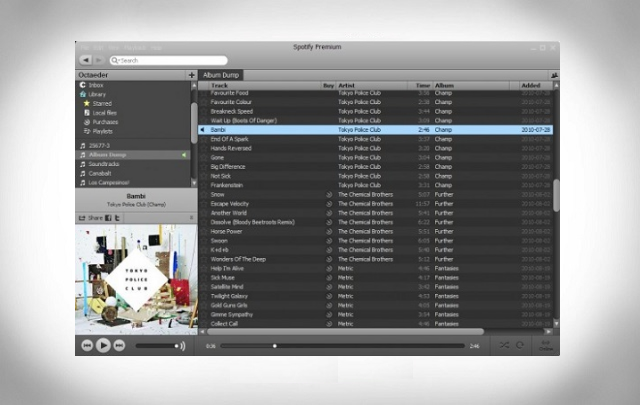
A quick search around the internet has given me an assortment of opinions from all types of people, but the main feeling seems to be that people are desperate for a Spotify desktop client which uses the same minimality and simplicity to use as the iPad and Android counterpart. Nobody likes a UI which has hundreds of buttons and links to click on in one screen, it may have been cool a few years ago but now it’s all about simplicity. It’s for this reason that Microsoft have changed their entire operating system ideas to reflect a simple design which simply uses tiles to navigate.
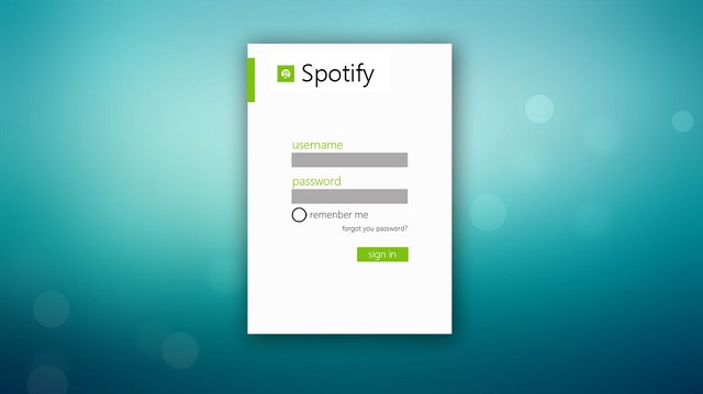
Of course, I’m talking about Windows 8. It’s an operating system which I have been using an early build of since September 2011. While I have mixed opinions on having an entire operating system built around minimalism, I love the simple applications available for Windows 8. A user DeviantArt even created a concept log-in screen for his Spotify for Windows 8 concept.
Below is another concept idea, this time found on the Behance Network. This user feels that while Spotify needs to change it’s design, it also needs to change it’s features. As of writing this, Spotify is lacking a small desktop widget, one that can be compacted from the large desktop view and can be easily opened on top of a video or web page.

Personally, I’m a huge fan of Spotify’s green house-style. It looks absolutely great on white and textured backgrounds but it looks boring on the design of the desktop application which is currently used. One Behance Network user obviously feels that Spotify needs an overhaul rather than a minor change, and has changed the entire client right down to the icon.
This isn’t the best idea in my opinion. The green house-style can now be easily recognised as Spotify and changing it to blue now would be silly. I’m not crazy about changing the UI to be heavily Apple based, but the rest of the design looks like a very solid and easy to use experience.
To conclude, I want to make it clear once again that I am a big fan of Spotify and everything it offers. I love the applications on both Android and iOS and think that they are easily contenders for my most used apps. Having a poor UI isn’t a deal-breaker for me, it’s just an annoyance. But I fail to see how a company with a design team capable of created amazing applications and a marketing team who can create simple but attractive adverts like this, can be happy allowing their valuable customers to use a very outdated client.


