Despite being released some time after the iOS application, Instagram for Android sports the same user interface as it’s Apple counterpart, with the exception of some added textures here and there.
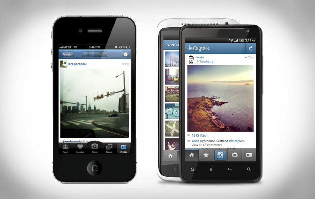
Instagram is one of the many applications which fail to comply with the Android design guidelines. It’s not a necessity to follow these guidelines, but it’s really nice to have a phone with applications which each follow the same design and even look like part of the user interface. It’s for this reason that most iOS applications, Instagram included, follow the same patterns.
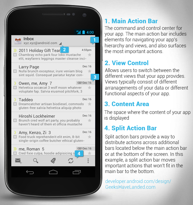
Above is the default Android application design introduced with Ice Cream Sandwich last year. While some may add fancy edges, many companies have managed to follow the guidelines very well. Some which spring to mind are Boid, Mentions and Spotify.
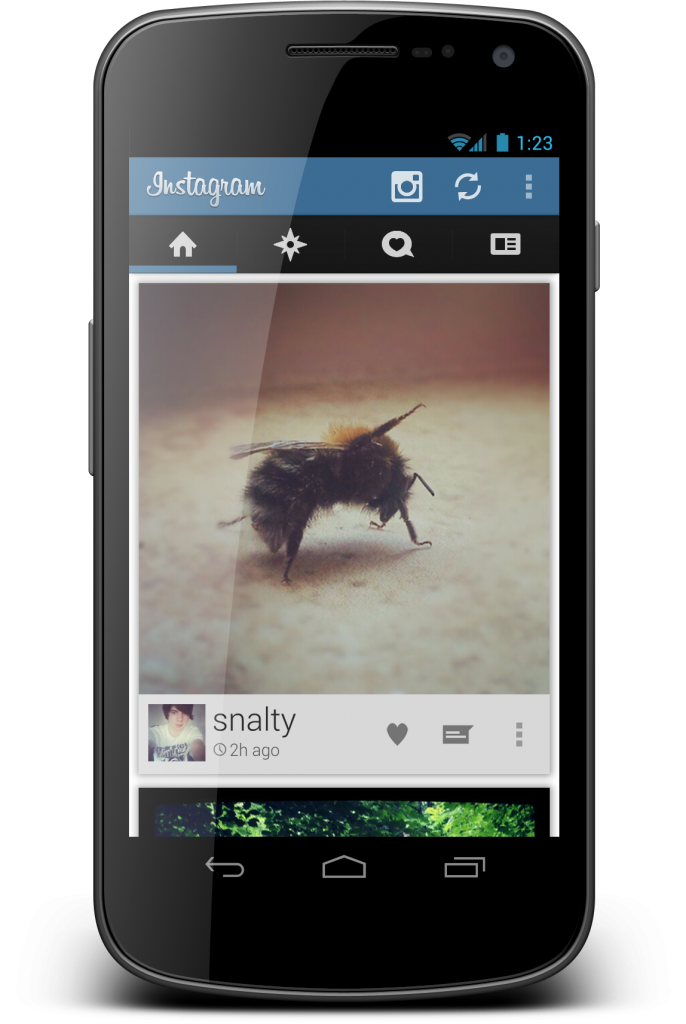
So, what would the outcome be if Instagram was to redesign according to the Holo guidelines? How about this?
The above concept was created by Redditor ‘naalty‘. It follows the holo theme very well, missing out a few of the tips however overall maintaining the ICS style.
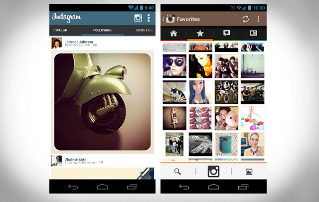
Above is another two concepts I’ve found. One by Devinnnwashere and one by Guenther Beyer. In my opinion neither are as good as the original concept, however they both match Holo design guidelines.
Instagram doesn’t look bad at the moment. In fact it’s probably one of the most well designed applications available for Android, however it would be nice if it could shed the iOS feel and make it feel like it was designed to be on Android.


